Eric Zhang
☺
creative practice specializing in design & motion
Product promotional video
Client: Hint
Product: Hint water
Skills: Concept Design, Art Direction, Motion Graphics Design, Illustration, SFX
Software: Adobe After Effects, Adobe Illustrator, Adobe Photoshop


FINAL DELIVERABLE
project overview
Conceptualization & Creative Spark
I conceptualized, art-directed, and executed this project from start to finish. The direction was inspired by a core directive in the creative brief: "Hint offers a special deal for new customers THROUGH OUR WEBSITE." This line defined both the destination (where) and the action (how), establishing Hint’s website as the focal point of the campaign.
Designing for the Modern Digital Audience
In today’s fast-paced digital ecosystem, communication has fundamentally evolved. Audiences no longer engage through deep, linear reading; instead, they are selective scanners who process content rapidly through visual hierarchy, movement, and interaction. Today’s viewers don't just want to read information—they want to experience it.
Applying Shape Psychology & Motion Design
To turn this insight into an engaging visual narrative, I leveraged the psychology of shape design and motion graphics:
• Visual Hierarchy & Flow: Geometric and organic shapes act as visual anchors, guiding the viewer’s eye naturally toward critical offer details and key callouts.
• Elevating Secondary Equities: I integrated Hint’s existing secondary brand elements—traditionally used in static packaging and social assets—and brought them to life through motion.
• Art Direction & Brand Identity: By animating these shapes within a playful, illustrative aesthetic, I created an approachable art direction that reinforces Hint’s core identity while driving clear campaign messaging.
Shot Breakdown
Shot 01: Brand Introduction & Hook
In digital advertising, capturing the viewer’s attention within the first five seconds is crucial. For Shot 01, my goal was to immediately hook the audience and introduce the brand using bold typography, dynamic shapes, and vibrant motion design.
• Motion & Brand Arrival: Every movement converges toward the vertical Hint logo, delivering a striking and unmistakable brand reveal.
• Kinetic Typography: Words literally mimic their meanings—"In" slides in from the side, "Fall" drops from above, and "Love" utilizes a stacked, staggered type layout to fill the space with playful emphasis. The word "With" serves as a bridge, seamlessly merging two halves of the Hint water bottle before transforming into the logo.
• Color Palette: Featuring Blueberry Lemon as the hero flavor, the palette leans into high-contrast complementary colors to maximize visual impact and guide the viewer's focus to key message points.



.png)
.png)
.png)
Shot 02: Product Identity & Value Proposition
With the brand introduced, Shot 02 highlights what Hint represents: delicious, fruit-infused water.
• Match Cut & Spatial Composition: A seamless match cut transitions the logo into stacked fruit elements (lemons and blueberries from the hero flavor) to mirror the footprint of the logo and visually emphasize rich, concentrated flavor.
• Character Animation: The fruit elements are animated as playful, expressive characters interacting with one another to reflect the energetic charisma of the brand.
• Kinetic Typography & Fluid Motion: Bold typography anchors "Delicious" and "Water" for instant scanning, while a "sandwich" layout unfolds to reveal "FRUIT-INFUSED." Liquid reveal animations add motion and reinforce the product's refreshing nature.
• Visual Harmony: The color palette directly connects the typography, fruit elements, and logo for a cohesive look.


.png)
.png)
.png)
.png)
Shot 03: Product Reveal & Feature Highlights
Shot 03 introduces the physical packaging featuring the hero Blueberry Lemon flavor, using fluid transitions and balanced composition to highlight key product attributes.
• Match Cut & Fluid Motion: A match cut enhanced with a squeeze-and-stretch movement smoothly morphs the lemon into the bottle, topped with a dynamic water splash for added energy.
• Visual Balance & Readability: A symmetrical layout frames the "0 Calories, 0 Sweeteners" callout, creating sense of order that allows viewers to scan and process key nutritional facts instantly.
• Interactive Transitions: Primary circular shapes animate as water ripples when the bottle drops into frame, triggering a splash that directs the viewer's focus toward the upcoming search bar animation.


.png)
.png)
.png)
.png)
.png)
.png)
.png)
Shot 04: Flavor Discovery & Digital Search Interaction
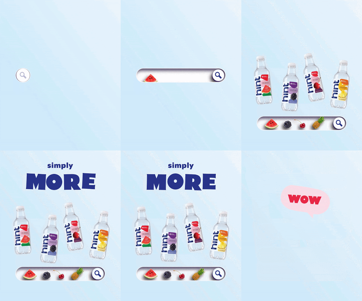
Building on the hero flavor introduced earlier, Shot 04 expands the narrative to showcase Hint's wider product lineup using intuitive digital metaphors.
• Universal Search Metaphor: The Blueberry Lemon bottle drops into frame and transforms into a magnifying glass icon—instantly signaling where (online), how (via Hint’s website), and what (discovering more flavors). Instead of typing text, animated fruit graphics and bottles populate the search bar, allowing viewers to quickly associate fresh fruit with each flavor option.
• Expressive Animation & Character: Playful micro-interactions bring each element to life—the word "More" squeezes under the weight of "Simply," the Watermelon bottle steps down on the search bar, and bottles fly out with personality. Floating elements evoke a sense of air and water, reinforcing nature and freshness, while a subtle eye-wink on the search icon re-engages the viewer before a rising message bubble clears the scene.
• Fresh Color Palette: The palette simplifies to crisp white, light blue, and Hint’s signature deep blue. Light blue establishes an inviting, refreshing atmosphere, while deep blue grounds the layout with clarity and trust—allowing the colorful product designs to stand out.

.png)
.png)
.png)
.png)
.png)
.png)
Shot 05: Organic Social Sharing & Brand Tone
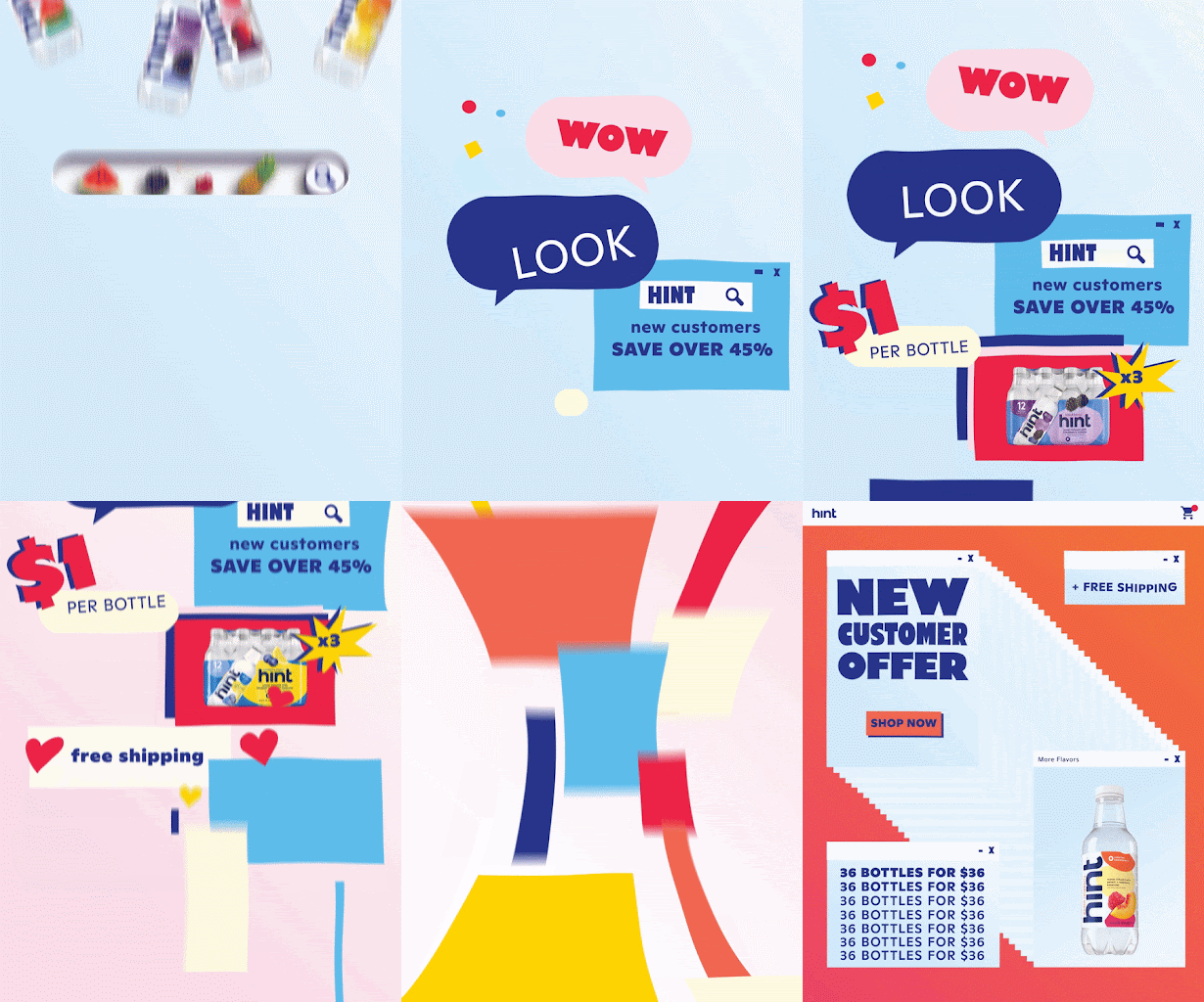
Shot 05 aligns with Hint’s friendly and approachable voice, framing the promotion as a organic recommendation shared between friends rather than a high-pressure sales pitch.
• Peer-to-Peer Communication Metaphor: The visual sequence mimics an everyday messaging conversation—starting with direct text bubbles, links, and product photos, then accelerating into abstracted shapes as the word-of-mouth excitement spreads across group chats.
• Expressive Graphics & Reactions: Emoji-inspired accent shapes, such as heart reaction icons, add warmth and personality, signaling the excitement and "love at first sight" users experience when discovering the deal.
• Dynamic Color Story: The background shifts from light blue to soft pink and back to blue, mirroring the evolving mood of the conversation. The shape colors transition from simple to vibrant to reflect rapid message sharing, ultimately resolving into a palette that matches the opening flavor of the end card.
• Pacing & Visual Rhythm: Alternating message animations (fast-slow-fast) create a natural rhythm that guides the eye left-to-right across the frame before transitioning smoothly into the final offer.

.png)
.png)
.png)
.png)
.png)
.png)
.png)
Shot 06: Dynamic End Card & Call to Action
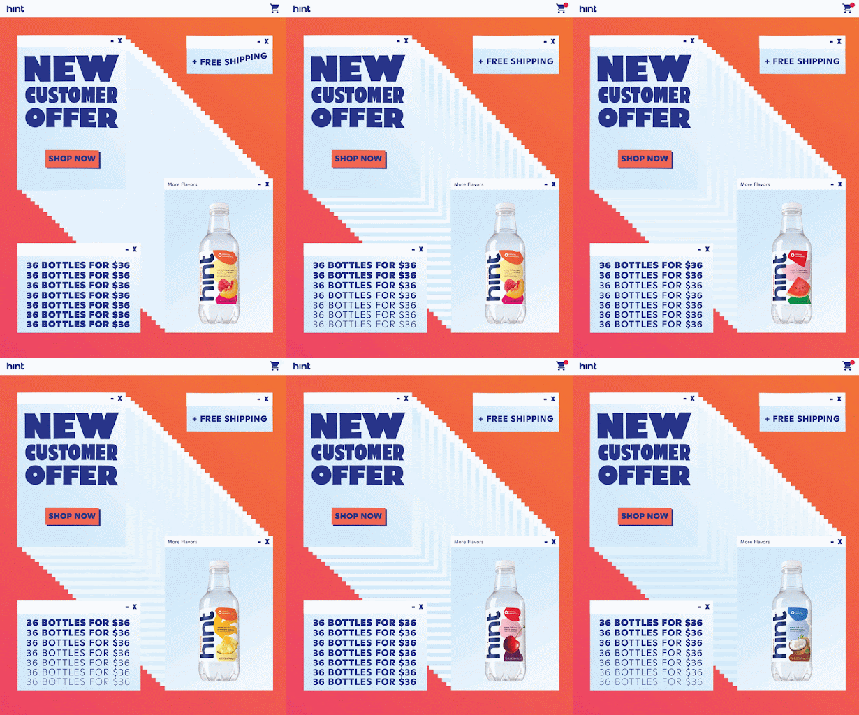
The final shot reinforces the campaign’s primary message—where, how, and what to buy—by converting the end card into a moving, UI-inspired digital experience.
• Interactive UI Metaphor: Rather than a static end screen, the layout incorporates web-design micro-interactions. The transition into the bottle triggers subtle motion elements, including a bouncing CTA button, variable font weight changes on "36 bottles for $36," a wave animation on "+ Free Shipping," and shifting color gradients across stacked panels.
• Graphic Structure & Hierarchy: Stacked browser window elements tie the digital theme together, emphasizing the "New Customer Offer" and CTA button. A strong diagonal line leads the viewer’s eye toward the flavor selection, resolving on the offer details with continuous looping animations.
• Cohesive Color & Fluidity: Orange hues and Hint’s deep blue circle back to the opening shot, while light blue accents highlight key copy. Liquid-inspired micro-animations maintain a fluid rhythm, subtlely reminding the viewer of the core product: refreshing water.